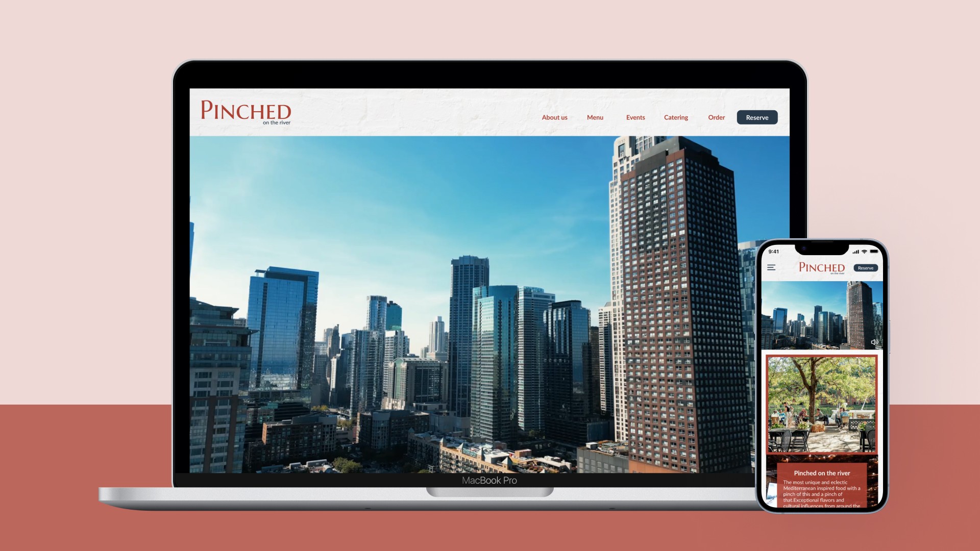
Pinched on the River: Redesign Table Reservation System
Design Thinking & Responsive Design
Role
UX Research
Interface Design Prototyping
Team
Team-based (Design Thinking)
Individual (Interface Design & Prototyping)
Client
School Project
Year
Nov 2023 - Dec 2023
Problem Statement
Rising Demand for Personalization: The increasing need for tailored bubble tea experiences highlights a growing trend among consumers.
Decision-Making Challenges: Bubble tea enthusiasts face decidophobia due to the overwhelming variety of flavors and options available.
Navigation and Location Issues: Users struggle to find and choose from the multitude of bubble tea offerings, particularly when trying to locate nearby shops that serve their preferred drinks.
Methodology
Discover
Our team conducted a thorough analysis of the current website, evaluated the business objectives, and assessed user needs. This stage was dedicated to gaining a deep understanding of the existing challenges and identifying key areas for improvement.
Define
At this stage, we focused on refining our insights. We pinpointed specific issues and defined the project's scope, ensuring that our approach aligned with the gathered information. This led to a clear and directed strategy for addressing the identified problems.
Ideate
In this phase, we engaged in creative brainstorming, using paper sketches to visualize a variety of potential solutions. This process allowed us to explore diverse ideas and approaches to solve the defined problems effectively.
Design
The final stage involved selecting the most promising ideas from the ideation phase. We then moved forward with developing detailed designs and creating prototypes for the website. These prototypes were iteratively refined, ensuring alignment with our project goals and user expectations.
Discover
In the initial stage of our analysis, we conducted a comprehensive evaluation of the website, covering aspects like brand identity, layout, and visual hierarchy. Through this thorough examination, we identified a total of 11 key issues that need addressing to enhance the website's overall effectiveness and user experience.
Reservation Flow: The current reservation process can lead users to exit the page.
Inconsistent Design: There is an inconsistent use of typefaces throughout the site.
Navigation Bar: Key functions, such as reservations and orders, need more prominence in the navigation bar.
Brand Identity: The logo used on the website differs from the original brand logo.
Layout: The placement of the address on the page is unconventional.
Visual Hierarchy: The spacing between text elements is disorganized.
Layout: The blocks on the site are excessively large and vary in size, leading to visual confusion.
Banner Position: The banner is positioned too low on the page.
Photo Overload: An excessive number of photos on the site can overwhelm users visually.
Homepage Organization: The information on the homepage is disorganized.
Footer Layout: Despite containing minimal information, the footer occupies an excessively large space.
Define
In the define stage, our team meticulously analyzed the website and successfully identified key issues. This process enabled us to create specific problem statements and accurately define the scope of the project, laying a solid foundation for targeted improvements.
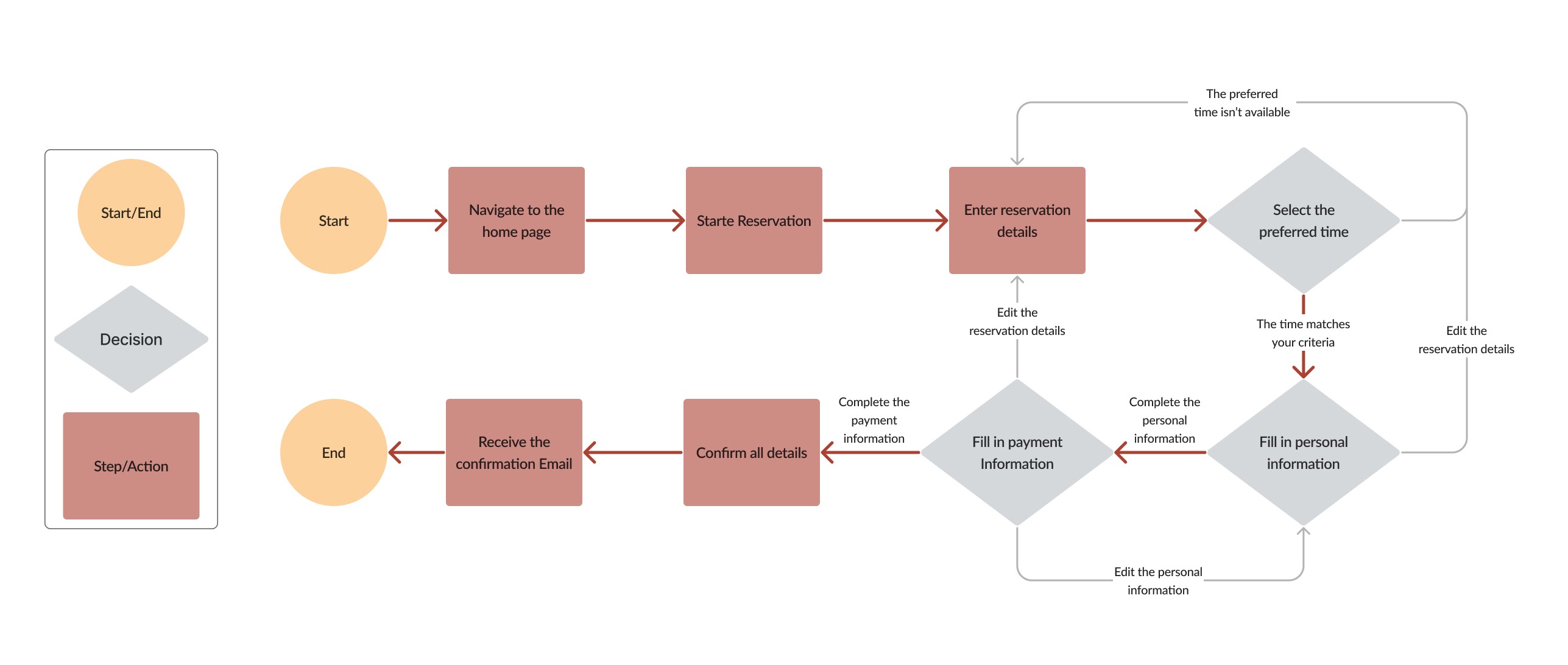
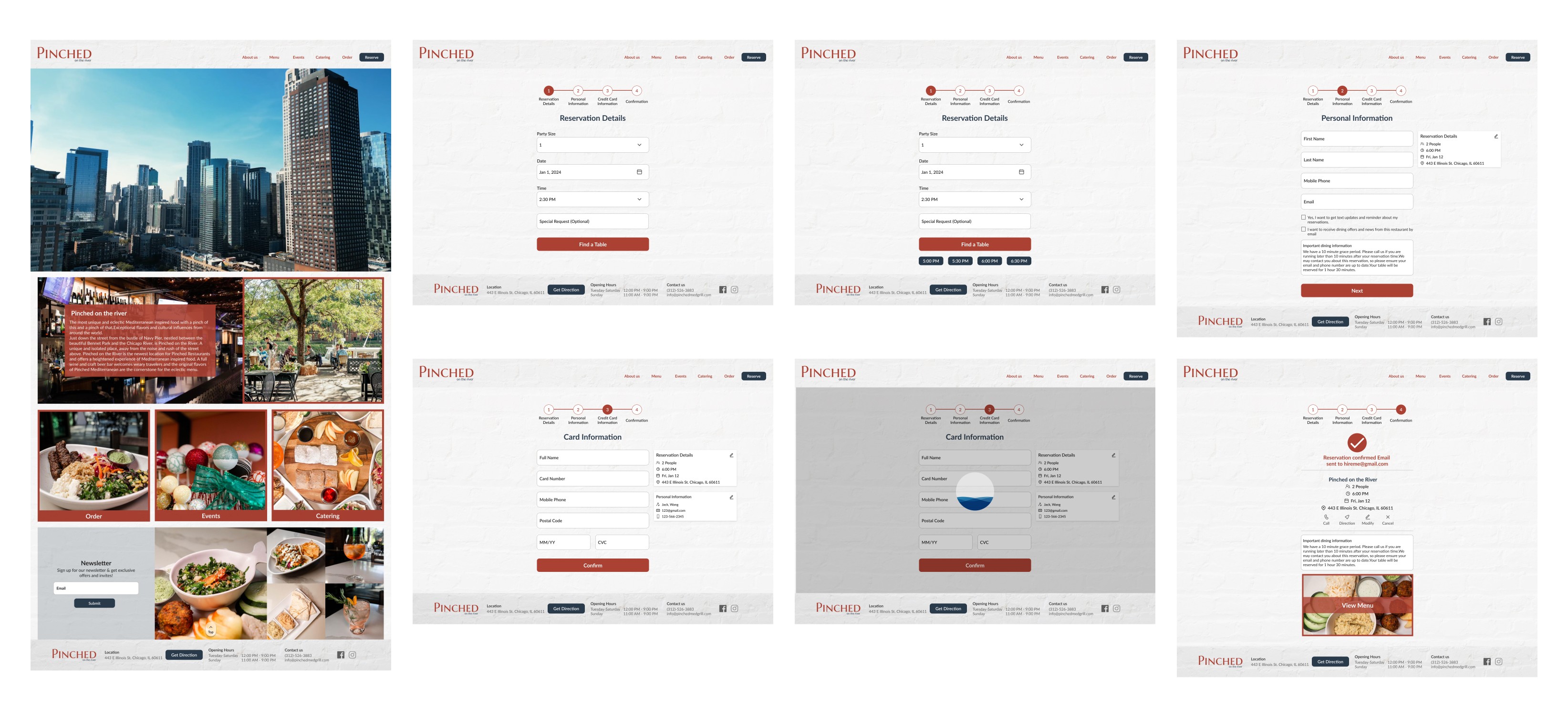
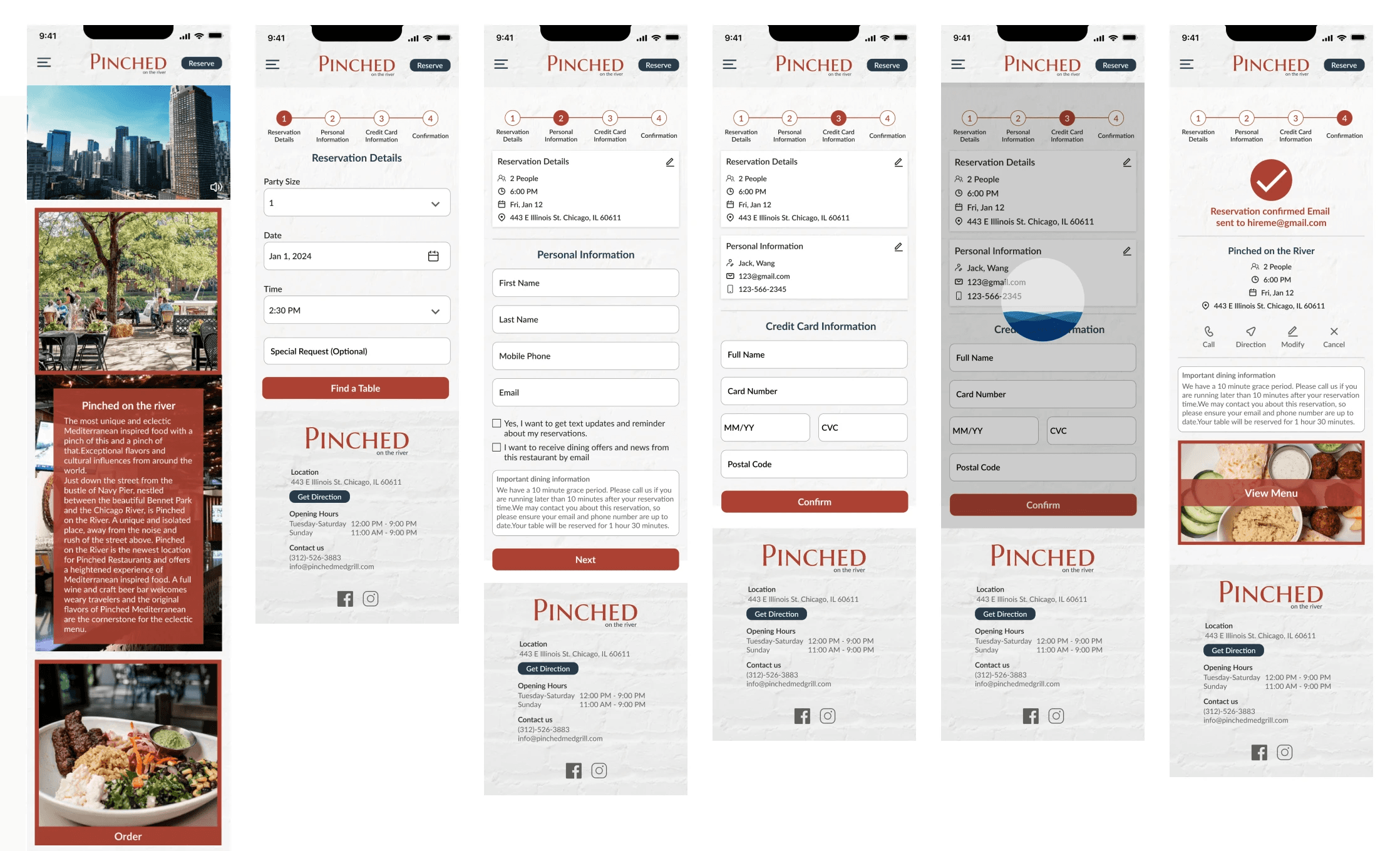
Create Table Reservation Flow: We plan to develop an integrated reservation flow within the website to ensure users remain on the site during the entire booking process.
Develop Design System: To achieve visual consistency and establish a clear hierarchy, we will develop a comprehensive design system. This system will guide all design aspects, ensuring a cohesive look and feel across the website.
Redesign Homepage: Beyond enhancing the table reservation feature, this project will also involve a complete redesign of the homepage. This redesign will not only incorporate the new reservation flow but also align with the updated brand identity and design system, ensuring a seamless user experience.
Ideate
In the ideate stage, our team engaged in a dynamic brainstorming session, fostering creativity and innovation. Following these discussions, we translated our ideas into preliminary sketches, visually conceptualizing potential solutions on paper.
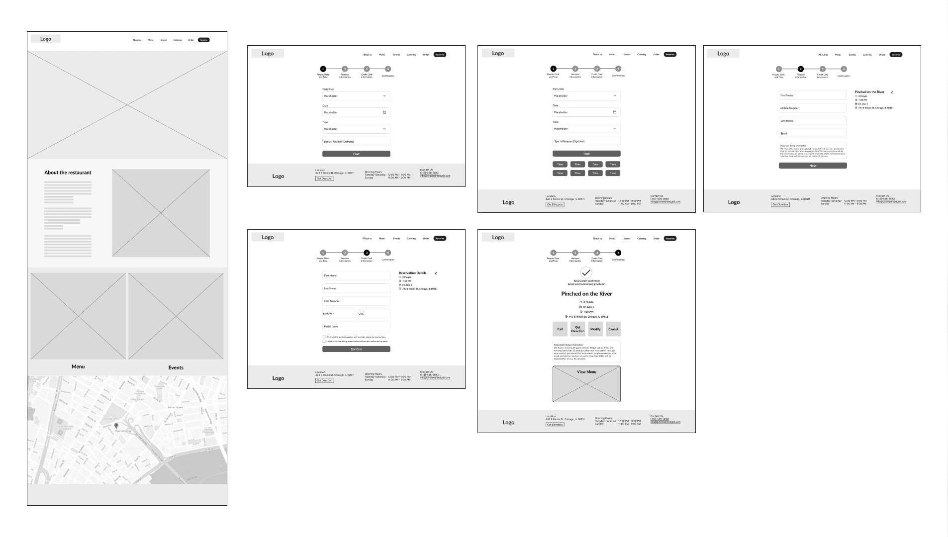
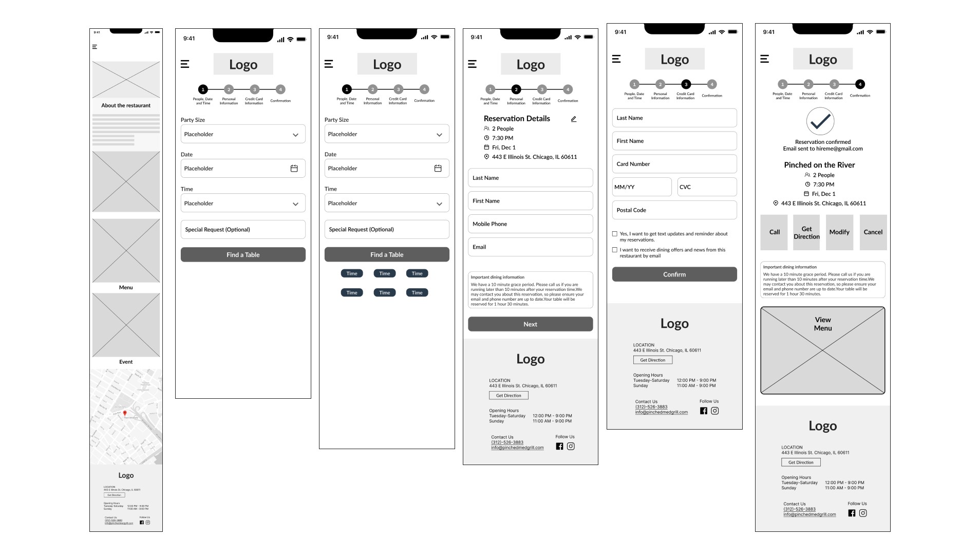
Wireframe
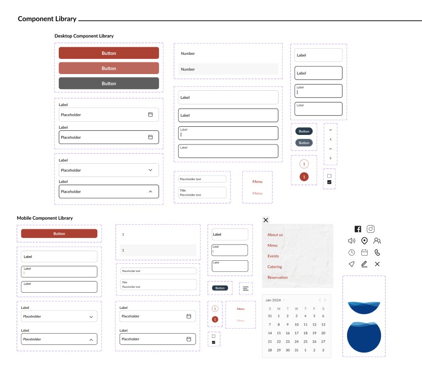
Design System and Component library
To ensure a cohesive aesthetic across the project, we established a design system that encompasses typography, text styles, color schemes, and elevation standards.
Final Design
Mockup
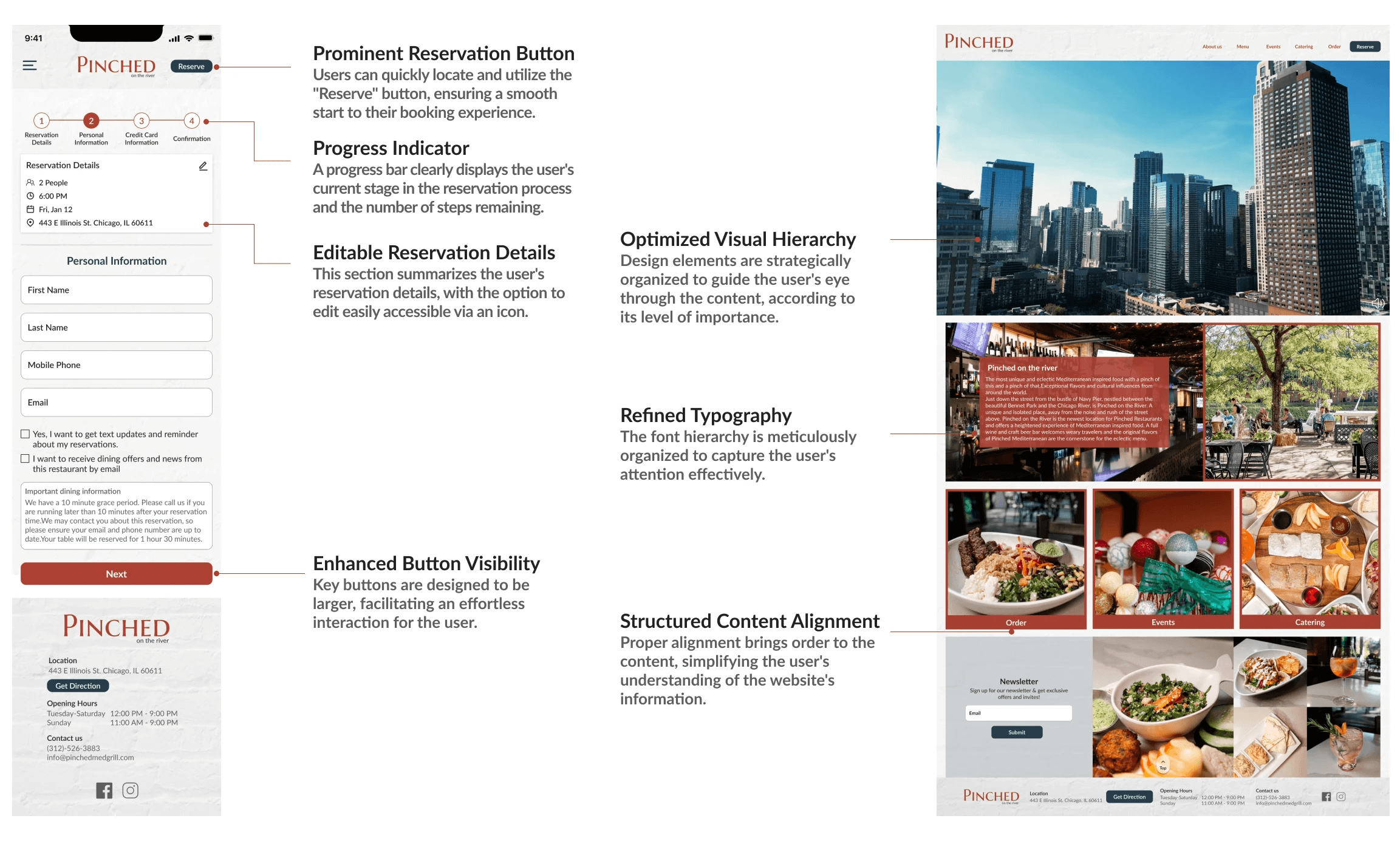
UI Explanation
Learnings
To save time and be more efficient, I learned the use of “ Set Variable” and “Conditional” when working with time pickers, date pickers and people pickers. This avoids the need for many frames.
To create a responsive design page that works well on both desktop and mobile versions, it's essential to consider the differences between the two and adjust accordingly.
Next Step
Expand to Other Pages: After setting up the foundational design system, the next step is to extend these standards to all other pages of the website.
Conduct Usability Testing: With the design updates implemented, the following critical phase is to conduct comprehensive usability testing.
