Airbnb SuperGuest: Elevating Travel with Rewarding Stays
UX Research & APP UI Design
My Role
UX Research
UI Design
Team (UX Researcher)
Alyssa Winder
Mansi Chugh
Esther Steve
Safa Hasan
Year
Sep 2023 - Dec 2023
Tools
Figma
Illustrator
Client
Airbnb (potentially)
Intro
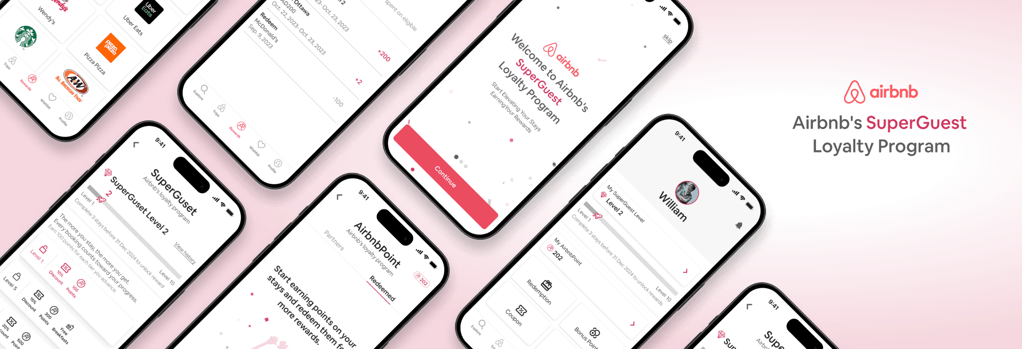
SuperGuest is Airbnb's rewards system, with two programs: tier-based benefits and a points system. The project improves the points program by making it user-friendly for redeeming rewards. The goal is to keep users and attract new ones to SuperGuest and Airbnb.
View the Prototype
Problem Statement
Lack of User Engagement and Retention Strategy: Airbnb's lack of a loyalty program misses opportunities to foster user engagement and loyalty, leading users to consider competitors.
HMW Statement
How might we create a user-friendly points system in SuperGuest to boost engagement and loyalty for Airbnb?
Outcome
A redesigned, user-friendly SuperGuest points system will increase user satisfaction and engagement, resulting in higher retention rates and attracting new users, ultimately leading to increased bookings and revenue growth for Airbnb.
Impact
Enhancing the SuperGuest points system could potentially engage and retain over 4 million Airbnb users, boosting loyalty and potentially increasing bookings by up to 15%, thereby strengthening Airbnb’s market position.
Design Concept
This diagram illustrates the foundational design principles and functionalities of the SuperGuest rewards system.
Methodology
Discover
Analyzed Booking.com and Vrbo's loyalty programs, revealing Airbnb's need for a competitive program to enhance user engagement and retention. Meanwhile, user interviews were conducted to gather users' feedback.
Define
Created a persona illustrating user expectations and pain points, highlighting the importance of a clear user journey and loyalty benefits.
Design
Developed 'SuperGuest,' a loyalty program with a focus on creating the Information Architecture (IA), user flow, design system, wireframes, and structured user interface, emphasizing intuitive navigation and accessible reward options.
Prototype and Mockup
Finalized the user interface and developed interactive models to visualize the design.
Discover
User Interview: Conduct user interviews to gather insights about user needs, behaviours, and experiences. This step helps collect useful information directly from potential users.
Competitive Analysis: Compare competitors' strengths and weaknesses to identify Airbnb's advantages and areas for improvement.
Insight of User Interviews
After conducting a competitive analysis, we continued to interview 10 Airbnb users to determine their desired reward system and their experiences with loyalty programs. The key findings of user interviews are below.
Discounts and Reward Points: Users seek clear communication on how to earn and redeem points for valuable rewards, enhancing platform engagement.
Meal Redemptions: Addressing the lack of meal options, Airbnb can partner with eateries to offer meal rewards, thereby enriching its value proposition.
Chance-Based Rewards: Introducing lottery-style games as a fun way to earn rewards, incentivizing user interaction through bookings and reviews.
Information Overload: Optimize user experience by allowing customizable communication preferences, avoiding overwhelming users with excessive emails.
Competitive Analysis Insights
First, a competitive analysis was conducted with Booking.com and Vrbo to identify Airbnb’s strengths and weaknesses. We found that both VRBO and Booking.com have an advantage over other platforms due to their loyalty programs. These programs are designed to reward users and promote loyalty, encouraging them to continue using their services for future bookings.
Airbnb stands out for its diverse range of accommodations, including unique and unconventional options, promoting personalized and local experiences. However, Airbnb lacks a loyalty program that provides a competitive edge and effectively engages users.
Booking.com offers a user-friendly booking process and a wide variety of accommodations, making it suitable for a broad audience. Moreover, Booking.com features the "Genius" loyalty program, providing discounts and perks for loyal customers, and enhancing user retention.
Vrbo specializes in vacation rentals, particularly whole homes and properties, catering primarily to families and groups. In addition, Vrbo features the “One Key” loyalty program. Members can join for free and earn and use OneKeyCash on bookings to get discounts and member-exclusive benefits.
Define
User Persona: Create detailed user personas to identify users' pain points and needs, ensuring the design addresses specific user challenges and preferences.
User Journey Map: Develop comprehensive user journey maps to visualize the user experience, highlighting key touchpoints, pain points, and opportunities for improvement.
User Persona and User Journey Map
Based on the results of the interviews, the project made a user persona named William and a user journey map to find out the pain points of Airbnb and the expectations of the loyalty program. The pain points are below.
Complex navigation or unclear user flow.
Confusion about point accumulation and redemption values.
Limited redemption options or undesirable rewards.
Technical issues with voucher generation or redemption.
Lack of clarity in the loyalty program's terms and conditions.
Design
Continue to develop the information architecture and user flow based on the user's needs, and then design the UI to demonstrate how the reward system will look.
Information Architecture
The information architecture demonstrates the structure of the Airbnb SuperGuest system, detailing levels, redemption processes, and point usage for benefits like coupons and lotteries.
User Flow
The diagram shows the steps a user takes to redeem a McDonald's breakfast using a rewards system, from start to confirmation via decisions and actions.
Sketch
Wireframe
Design System and Component library
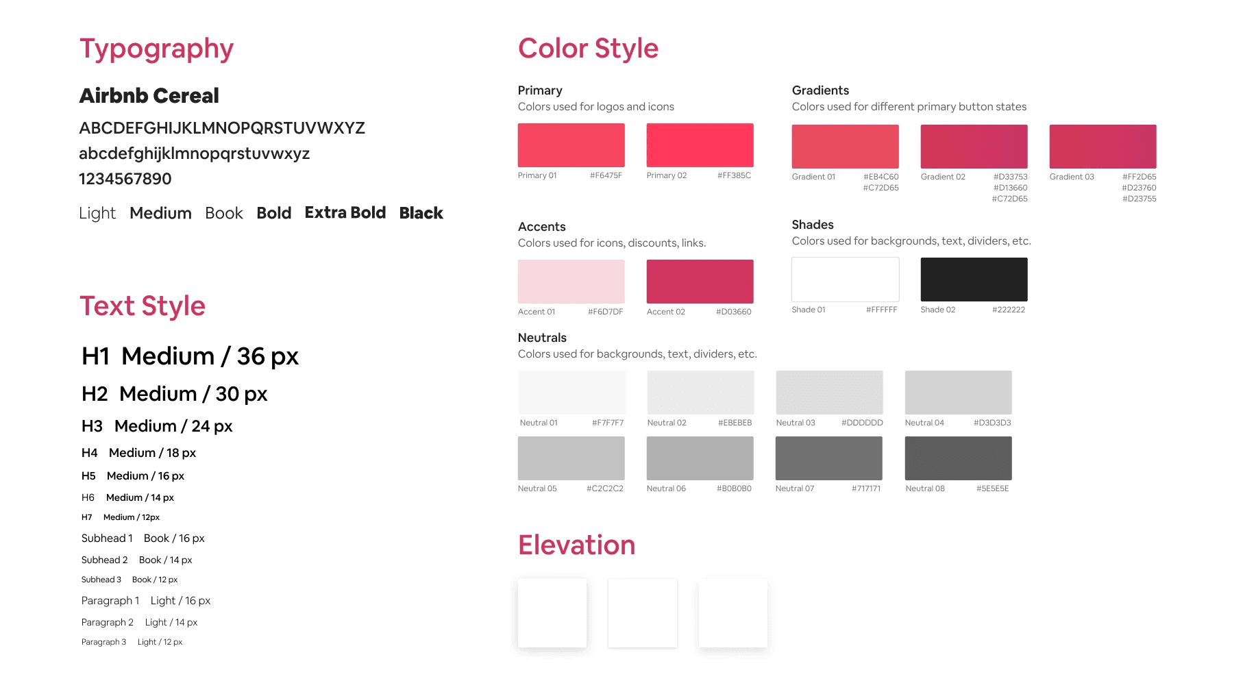
To maintain consistency with the real Airbnb app, this project follows Airbnb's original design system, including typography, text, colour style and elevation.
Final Design
Prototyping and Mockup
Analysis and Synthesis: Analyze the data collected during the Discover phase to define the core problems and opportunities. This will involve identifying key user pain points and opportunities for improvement in the chatbot’s design and functionality.
View the Prototype
Learnings
Managed time constraints and made informed design decisions, key skills in UX design.
Recognized the importance of user research and feedback in product development.
Eager to continue as a UX designer, focusing on creating meaningful, user-centric experiences.
Reinforced commitment to designing solutions with positive impacts on users' lives. Appreciated the transformative power of thoughtful design in everyday interactions
Next Step
Engagement Evaluation: Investigate the effectiveness of the rewards and redemption features in maintaining user engagement and promoting frequent app usage.
Extended Functionality Design: Develop additional functional pages, including Bonus Points, Airbnb Lottery, and complementary features to enrich the loyalty program experience.
Usability Testing: Conduct usability testing sessions to evaluate the user-friendliness of the redesigned interface and identify areas for improvement.


